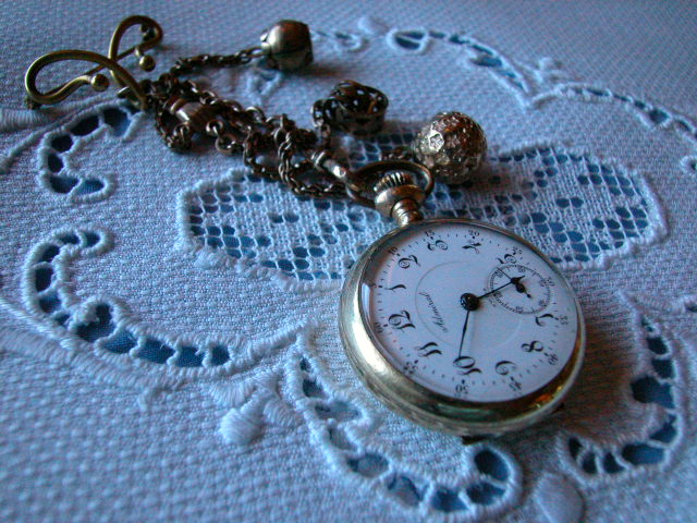
adjusting to get rid of the overall blue tinge would improve this and turning the watch to face the camera would help too. I like the vintage look to the image though. I collect vintage linens so it has natural appeal to me.
This is a bit too dark. (I found you in the watch reflection!) The chain needs alot more light to show it off. Multiple textures well displayed. Good focus and focal range. Nice angle of attack. I'm sure you got at least one comment about the watch not being square with the frame, who cares! I like that part fine. I just realized the stem of this watch is at 3:00, not 12:00, as my pocket watch is. If this shot weren't so dark, I think I could have gone as high as 9, all other things equal, but as submitted I have to top out at 7 (started as a 6, please feel good!) Swash
The blue cast in this photo makes it look as though it was taken either early in the morning or late in the evening. Gives a very nice mood to the photo.
Composition7 Originality7 Technical Aspects6 Meets Challenge7 Total Score7
For those that are just learning, like me.
Composition: Scoring in this area is based on basic composition of a picture and includes the rule of thirds, balance, cropping, and curved and diagonal lines. Subject matter that does not lend itself to the picture or otherwise unwanted is also considered here.
Originality: Scoring in this area is based on pictures or concepts that I have seen, as well as how much effort you have invested in the picture. Usually a little something that sets it aside from a snapshot. Does it make me want to come back for another look? You know things like that.
Technical Aspects: Focus, exposure, lighting, and other special effects (done by the camera), and post processing are all considered in this category.
Meets Challenge: This is based on my interpretation of if you, have/have not, met the challenge. This is fairly simple but quite important for this site.
There are many sites that can give you assistance in achieving better skills in photography, but I think the best way to learn is to take pictures and show them to other people. Believe me when it is a good one you will know it.
I like how you have set this picture up, and the contrasting elements you have used. Don't know if it was intentional or not, but it seems like it has a bluish tint to me.
Nice photo. You might be carefull about setting the white point on the watch face (unless it is a light blue). Good job of reducing the specular reflections on the watch case.
this works much better if adjusted so the watch face is white and the whole thing is then converted to greyscale. I tried it cropped down a bit also and ended up with quite a nice image. Oh and the time is wrong as well.
I think the lighting here is a bit weak.. i would love to see it a ittle brighter and a little whiter. The watch being upside down confuses me a little as well... = 5 - jmsetzler
nice textures, and I like the placement of the watch within the pattern. I also like how you didn't just shoot the fabric by itself. major points for that.






 Add photograph to your favorites
 Add photographer to your favorites


