Hi! Here’s a comment from the Critique Club.
First Impression:
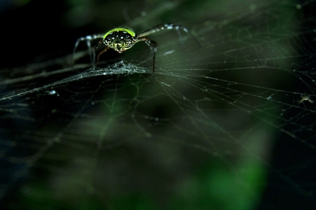
Nice shot! My eyes went to the spider, the bottom right corner along the bottom and then back to the spider body
Composition:
I like the balance of dark and green. Top left dark balances with the bottom right dark area. The spider balanced by the green area in the bottom right. I think I may have changed the angle slightly to see more of the spider body.
Subject:
Meets challenge, but does not come across as an obvious “looking up” shot.
Technical:
I like the lighting and colours. DOF is really shallow. Would have been nice to have more of the spider and web in focus. You didn’t mention cropping. If this was out of camera placement, well done.
Summary:
Nice capture and colours. The lack of obvious “looking up” and the shallow perspective on the spider may have hurt your score. Voters usually don’t spend a lot of time figuring out what they are looking at. Good luck in future entries!
|





 Add photograph to your favorites
 Add photographer to your favorites

 Photographer found comment helpful.


