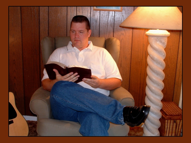
Nice thought but I believe here you tried to include too much in the photo. The subject is the man reading the bible. The light wicker basket and lamp don't really add to the overall shot.
Better cropping would have helped this. The topic picture frame and the white to the right of the photo distract. The photo also looks a bit at an angle. It has clarity and is interesting.
I wouldn't be able to tell that was the bible if it weren't for the title. Perhaps get closer or have another indication? I love the lighting/colors though.





 Add photograph to your favorites
 Add photographer to your favorites


 Photographer found comment helpful.


