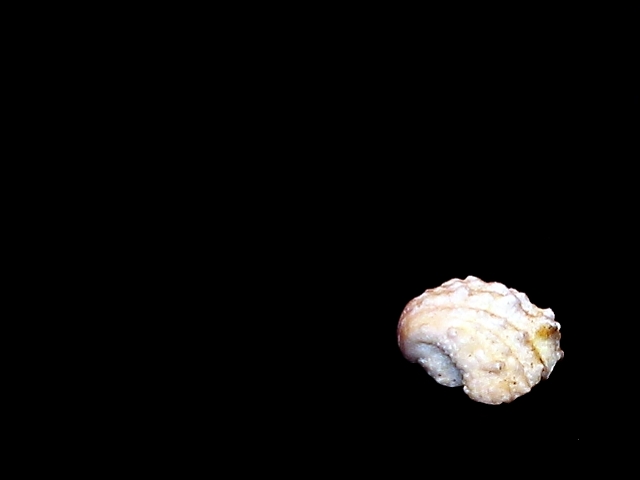
Very dramatic lighting. It would be one of my favorites if you had given the shell about 1/2 less stop exposure or darkened it in your imaging program. The lightest parts are a litle burned out and it looks like the darker areas of the shell would still have detail in them.
The shell is out of focus and little bit overexposed. While I like the creative effort that as gone into this idea, I feel that the dead space draws your eye away from the texture of the shell. Dead space can be a valuable tool for creating atmosphere. I used it in my photo "Who's there?" in the fear challenge. I wanted to leave it to their imagination. But I feel that this is distracting in "this" photo. Maybe if the shell was a bigger part of the image the dead ground would look better. Just my 2 cents worth. Hope this is useful for the future. happy snapping , "5" Dogman :-) Just a quick addition - Look at "pink Murex" in this weeks challenge as a good example of what I was trying to say.
I really like the use of negative space and the composition of the shot. The only thing I would like to see done differently is the lighting. you might try lighting from the side to bring out the texture and make some nice dreamatic shadows. also, maybe find a more appealing shell? I dunno.
great use of rule of thirds and negative space. great even black background. this one doesn't jump out at me for texture though, because so much of it is just plain black. the shell is just a tad overexposed. -- gr8photos (5)
This really doesn't fit the idea I had for this challenge, but it is texture. And it is in focus too. Those are two things a *lot* of pictures in this challenge are missing. *5* -balynch
I'm trying to understand "negative space" photos. I guess it just isn't my taste. However, keeping my biased opinion in mind, I will say this has potential. I am wishing the shell appears a bit larger in the photo, perhaps taking up the lower corner to no more than half way up or across the photo space. Also, I think different lighting across/around/on the shell may have given more dimension to this. (5) Email me if you want to, after the challenge, as I am eager to understand negative space.
I like the empty space, and the black background, I just wish the surface of the shell was a little more visible. It seems a little washed out and it seems to have lost some details. karmat
more of the subject would be nice. and with a title like yours i would have turned the shell over to show the smoothness inside (all the better to hear it from), rather than the rough exterior. ~mcmurma Aesthetics...3 Meets Challenge...4 Overall...4
I am having a hard time grading this shot. At first, I gave it a five, thinking the shot was just to bare, low texture value, but as I ponder this photo to write this text, I find it grows on me and the power of the smaller object pushes me to look at it more closely. (You're manipulating me!) Nice job. I still think the upper/middle section is a little overly bright, so less of the shell is as distinct as I would have liked to have seen it. I'm going to raise you up to a seven, as there are still a few problematic areas. I also think the negative area is too large. 7 Swash
Because I believe that this is an honest and artistic endeaver from someone who understands art, I am going to give my full and honest response to this photo. I think I understand the concept of negative space, but I'm not so sure that it works with this particular subject. Possibly because I don't get a great sense of depth from the subject, which leaves me with the impression of a semi-circular object in the corner of a dark frame. My attention is drawn to it very effectively (good use of negative space), but the object itself lacks the pizazz needed to keep my interest. This may simply be the lighting or it may be the physical object. Even so I score it high for artistic and creative vision, but not as high as it might have, given a better subject or a better view of this subject.







 Add photograph to your favorites
 Add photographer to your favorites


