It was a glorious winter day with bright sunshine and a rich blue sky, so it was a day to head out for some dpc hunting.
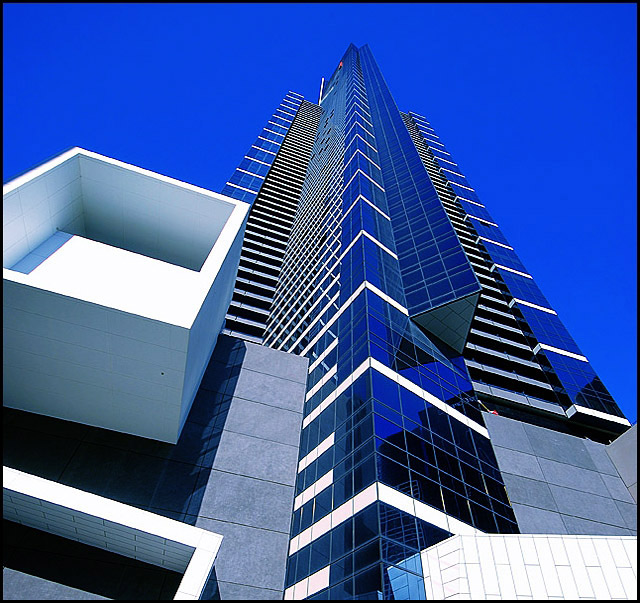
This is Melbourne\'s tallest building in Southbank.
I actually did a quick edit in Picasa converting to B and W, sharpening, making some contrast adjustments and changing the colour temperature.
On trying to achieve the same in Photocshop CS2, I just couldn\'t match it, so I transferred the edited shot there, did some work with curves and USM and a little Noise Ninja. Then the clincher: Hue change to red. I ahve a red version of this shot with a red, red sky, but figured it was a love it or hate it shot, thought I prefer it. A second opinion from my son and a thrid from my PA said, go for the blue, so blue it is!
Added the thin border, resized and am pretty happy with the result. It\'s got a geometric style about it. Hopefully the voters will be kind.
I like the white lines and the deep cobalt sky. I love the window reflections as well. Hope you like it...hope for a 6.4 plus.
POST CHALLENGE
thanks everyone...I wanted a 6.4...got it!
Here are some outtakes
I like the red, and prefered this but thought it would polarise the voters
Statistics
Place: 9 out of 361 Avg (all users): 6.4709 Avg (commenters): 7.5263 Avg (participants): 6.1895 Avg (non-participants): 6.6797 Views since voting: 2091 Views during voting: 292 Votes: 223 Comments: 30 Favorites: 3 (view)
I drew this for Critique Club but the site closed it down when they did the results refresh. I figure I owe you the Critique (anyway I had started thinking about it) so I've come back.
Congraulations on the great score - it's always nice to bring in what you set out for. This shot provides a magnificent sense of perspective - you have managed to get your angles just right to convey the sheer towering magnificence.Good going. The crispness and colours you have managed to achieve on the building are superb - good editing.
Personally I am not a fan of the extreme blue of the sky. I would have marked you down a bit for it. Clearly many other have a different take and love it. I'm guessing the change of hue to blue won you more votes than it lose you. Still I would have preferred a more natural colour.
This looks like a shot where offering a 6 will lower your average lol. I am getting a little moire but hey, guess thats to be expected. A nice clean, sharp and vibrant composition - good luck! (8)
wow that sky is saturated! maybe too much - tone down the sky and go sell this to the architects/owners. This is good work worthy of hanging on the architects wall.
If you have to have architecture, then do it in a blazingly grand manner. You did. Being steel and glass... it's a bit sterile. But it does represent the modern and is certainly a viewpoint from the ground up. 7.





 Add photograph to your favorites
 Add photographer to your favorites


 Photographer found comment helpful.


