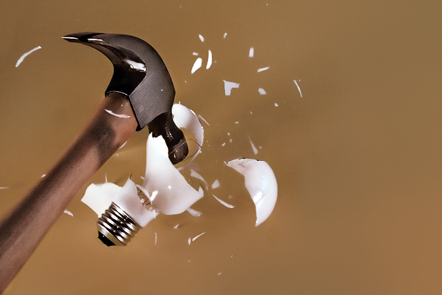
The background was originally yellow and then converted in post. My lighting situation sucks so any extra light I can get to reflect off the background is a plus.
Judging by the comments I should have probably left the background yellow. The color I did choose I felt worked best at focusing the attention on the actual subject at hand. In hindsight I should have cropped this more but both of those I would consider nitpicks and judging by the score people found a lot more to hate about this photo so I consider this to be a complete and utter failure. Ah well, at least it was stop motion.
P.S. There really isn't any blur on the handle. I probably just neatimaged/dodge/burned it too much.
Statistics
Place: 110 out of 212 Avg (all users): 5.4703 Avg (commenters): 6.5000 Avg (participants): 5.2024 Avg (non-participants): 5.6610 Views since voting: 1520 Views during voting: 353 Votes: 202 Comments: 9 Favorites: 1 (view)
Wow! I sure would have expected a much MUCH higher score for this one than 5.4 -- once again confirming how badly I suck at determining what the voters will love. I'm one voter who thinks this is awesome :)
how underrated was this?!!!! makes one want to grab their bottom lip and pull it over their head...I thought this would finish at least top 10! I like the background colour btw...square crop next time Richard
i know this took some effort, and i would have to say you achieved the result of capturing the breaking glass. however, that background color really doesn't do much for the image. also, i don't think all that negative space on the right is adding anything either.
First thing that jumps out at me is the shadow on the hammer handle. You've stopped the motion of the bulb breaking just fine. The hammer head is good and crisp. The lower part of the handle looks blurry but I think that's a DOF thing. Lighting is good. Should do well with this if the voters aren't tired of this subject. ;^) Good luck.
Great capture of the blub smashing, I like the fact you can't tell that is lying on a surface (if indeed it is). The composition is a little off in my opinion. The negative space on the right doesn't add to the effect. The colours are quite bland and this is usually frowned upon with DPC voters. The only other problem this image will get is that there are at least 5 other blubs being smashed.







 Add photograph to your favorites
 Add photographer to your favorites

 Photographer found comment helpful.


