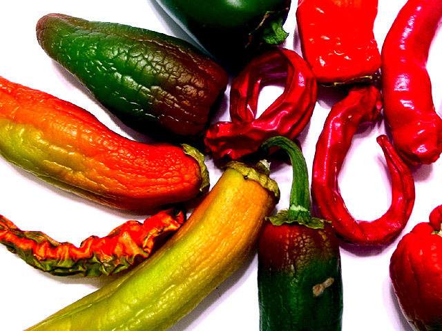
very nice arrangement and texture... the white background works very well here and I see you may have the same problem I have with my F707... the reds in the upper right are a little over saturated... I haven't quite figured out how to deal with that myself... I usually try to desaturate the red channel some with software... good shot :) = 7 - jmsetzler
I like the colors and the configuration...my s.o. doesn't like it cuz she doesn't like set shots. Texture is good... feel like it could be stronger in this regard. 5 sjgleah
These peppers definately fit the test of "texture". However, it looks like you may have gone overboard on levels and sharpening. Nice composition, as well as focus. The exposure looks okay, but I think the shadows are a bit dark and could use some more detail. *6* -balynch
The texture of several peppers, particularly the red/green one on top left, is very nice. This is a nice picture but what makes it weak is the composition. All the peppers on the right are red and that leads your eye right OUT of the pic. Perhaps 1-2 more large peppers shown in whole? Soft focus, or not enough definition, on the red green pepper on the bottom, mars the effect for me.
Good comparison of different textures on the same vegetable! Seems a bit too bright, especially the red at the top right. Maybe less brightness/contrast would have given a more realistic effect.
What kind of light were you using? it seems to have given a purple cast to the shadows and some of the highlights within the peppers on the right. The textures are well handled even though they are subtle. There are leading lines toward the right red peppers and that works well. 9
The photo on my monitor seems overly saturated, especially in the reds. I don't particularly care for the old, declining peppers...although their texture IS different from the others. The arrangement of the peppers is not random enough to be random (all stems pointed inward) nor static enough to form a pattern. IMHO
Wow - I just commented on about 20 pictures that had too little colour. And now I find this one that has too much. Plenty of texture there but the vibrant, almost blocks of colour distract too much from it.







 Add photograph to your favorites
 Add photographer to your favorites


