Do not think this is gone do good as it is not really stopped motion but the illusion of it
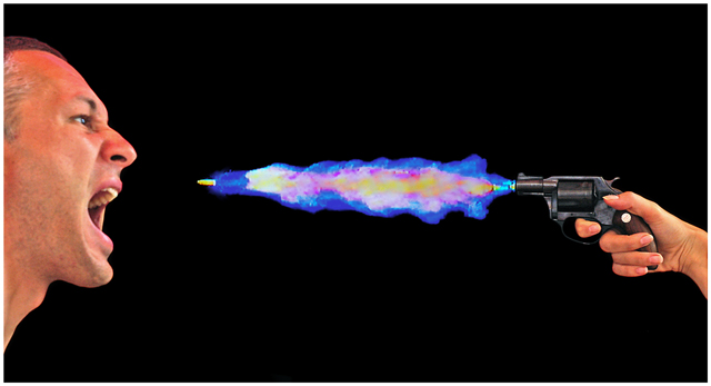
Double Exposure, one to get the hand and face, and the other one to get the fire and bullet which were projected on my TV - Double exposure was needed because the TV brightness was different than the ambient light
Cable release on my right hand.. GF helped with the gun
Statistics
Place: 115 out of 212 Avg (all users): 5.4061 Avg (commenters): 5.8333 Avg (participants): 5.2436 Avg (non-participants): 5.5126 Views since voting: 1950 Views during voting: 683 Votes: 197 Comments: 21 Favorites: 0
This is a different take on the challenge. I'm not sure I really like it, but it is what it is.
The flames 'coming out of' the barrel of the gun don't look right. Too much color. Too many different colors. You have a bullet that isn't a bullet, it's a shell with the bullet still inside. The color of lighting on the face and hand don't match the color of lighting of the bullet and flames. The facial expressions of the model on the left look forced. The hand holding the gun is at an odd angle to the wrist. Put all these together and I think it explains the score that you recieved.
My personal oppinion: This looks too much like digital art and not enough like photography for me. Nothing personal, just MHO.
Although this has been validated, I find this too much like digital art and not a photograph. The person's face seems like it was added, the bullet is still in its casing, and the smoke doesn't look real.
The thumbnail makes me say Yikes! Fun and scary image at the same time. I have a good idea of how you've done this (will look to photographers comments to confirm afterwards...he-he). The hand on the right is sharp, the face on the left is not. That's what will keep this image from making it to the top IMO. Good luck...and be careful playing with those guns!!!
Nice concept and a cool shot. The processing on the smoke/bullet feels kinda strange to me. Might be cool to add depth by taking an angle other than a straight profile if possible.
I think "Enough" would be an appropriate title. The man has an angry abusive look and the gun is being held by a woman; she's finally had enough and fighting back. Not very realistic though. The woman clearly has never shot a gun before. She'd probably beak some part of her wrist that way. I like the flame look, but not realistic. I'd love to know how you put this together. -7
very cleverly staged, i'll admit that. personally don't think that the guys head actually adds much to the overall composition; to me his expression is such that makes the whole thing a bit, erm, silly i suppose... technically it's really good, but in terms of striking an appealing chord with me, doesn't quite do it... personal taste i suppose. erm, 6.
Hope you did not really shoot him :o) Good idea, wish the "fire" would not look so.... I don´t wan´t to say fake because I am sure it isn´t, but sometimes things that are real do not look real... Anyhow, it will get an 8 from me, would give it more if the colors were better, but... good luck.






 Add photograph to your favorites
 Add photographer to your favorites

 Photographer found comment helpful.


