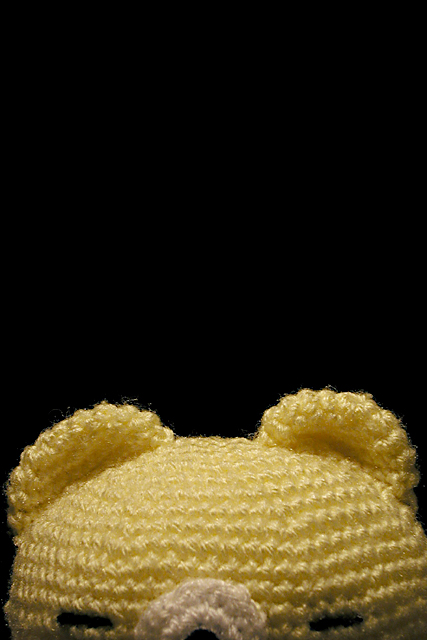
This is my second Peakaboo shot. I wanted to work with negative space and my first shot used a white background which ended up having a grey gradient fade and the head was a bit over exposed. So I reshot this with the bear in front of a black back ground. The idea of the negative space here is to draw the eyes of the viewer down to the bear to view the texture. I hope you liked it.
Statistics
Place: 152 out of 218 Avg (all users): 4.8427 Avg (commenters): 6.6500 Avg (participants): 4.8067 Avg (non-participants): 4.8980 Views since voting: 970 Votes: 248 Comments: 22 Favorites: 2 (view)
I like the vertical orientation and the 'peekaboo' concept on this photo. The texture is also quite nice... The empty space in this photo really emphasizes the 'peekaboo' concept quite nicely... the only critique I have is that the lighting around the bear's eyes may be a tad weak... good shot :) = 7 - jmsetzler
Cute shot. Great focus. I know it's "dramatic" to introduce large negative spaces, but personally, I have a hard time appreciating it. (Sort of like a song with 30 seconds of silence in the middle, it upsets me) You have great texture, but I just can't see more than 6. Swash
The detail in the strands of fibers above the ears is nice. I think this may have worked better if there was something to fill the black space above the stuffed animal. Otherwise, it fits the challenge. *5* -balynch
hehehe. this seems to be the cuddly toy challenge (especially after that discussion about lisa's frog). nice focus. good idea. who knitted him/her? i like your evenly black background and that you tried to play with negative space. i think it didn't quite work (in my opinion) because the teddy takes up ALL of the bottom part of the picture instead of just part of it. but others may disagree with me here. -- gr8photos (5)
I like that the bear is only in the lower third. I like the lighting and the extreme black of the background against the bear. It shows a nice texture. And yet, it doesn't move me as a viewer. It's doesn't compel me to touch it or avoid it.
I like the simple colors and composition. Maybe if just a wee bit more of the head was showing, I wouldn't feel like it accidentally got chopped off. karmat
I'm very curious to see how you score. I had a similar picture and was told that the idea & didn't fit the challenge well. I like it, however it would have been better if the bear was cropped exactly in the middle!





 Add photograph to your favorites
 Add photographer to your favorites


