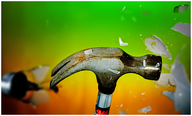
I sucked at this. I tried to spice it up with the background, but everyone saw right thru it. I thought maybe high 5's or 6.0, but alas it wasn't that good. The object in the background is the bottom of the light bulb flying away after impact, for those that wondered...
Statistics
Place: 92 out of 212 Avg (all users): 5.5895 Avg (commenters): 6.8333 Avg (participants): 5.4533 Avg (non-participants): 5.6783 Views since voting: 962 Views during voting: 367 Votes: 190 Comments: 8 Favorites: 0
Not sure that the rotation helps the impact on this. Haven't quite stopped the motion as the hammer is a little blurry and many of the pieces flying around are OOF. Great effort, and I'm sure you had fun putting this together. Good luck in the challenge.
i get the idea, and like the colored background, but feel there is too much focus on the hammer and not enough of the glass to really get the idea across.
Very creative. The composition seems a bit loose though. I'm not really sure of a better way to say it, but the negative space in the upper left with the tight crop on the right and bottom is a little troubling for me. Great color.
clearly people here have an angewr against the humble light bulb... i do like the details in this picture; the bright colours in the background is creatively original and rather striking, and the head of the has an interesting aged style. i like that the focus is on the hammer rather than the bulb. i'm not sure what the black thing on the left is though; it oddly doesn't look wrong, but i am spending too much time trying to figure it out... i like it's slightly wierdness; 9.





 Add photograph to your favorites
 Add photographer to your favorites


 Photographer found comment helpful.


