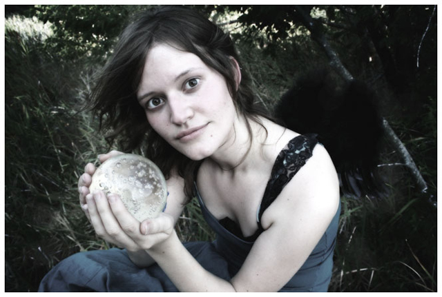
Whoa...I almost missed the wings. If not for the title, I probably would have. This is an interesting shot, and I like the washed-out colors. To be honest, though, I think the lights are almost too light, and the darks are almost too dark.
Composition: 4 - The centered composition doesnt really work here for me.
Technical: 3 - Its very soft, it could really do with a sharpen. Also, the colours being muted could work, but in this case I think it just makes it a bit less interesting.
Creativity: 5 - A creative idea for portrait, but the angle etc aren't that creative.
Appeal: 3





 Add photograph to your favorites
 Add photographer to your favorites

 Photographer found comment helpful.


