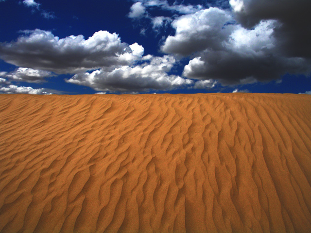
original is overexposed, so i dunno... did some contrast and brightness adjusting, curve adjustment, some selective color adjustment, saturation. not much else.
Statistics
Place: 5 out of 361 Avg (all users): 6.6216 Avg (commenters): 7.7692 Avg (participants): 6.5408 Avg (non-participants): 6.6855 Views since voting: 2363 Views during voting: 321 Votes: 222 Comments: 21 Favorites: 3 (view)
hey Brett - we just painted my son's room that same deep orange color (lower 1/3 of the wall) and a dark blue denim color for the upper part, boy sure wish I could simulate the texture and the clouds - then I'd have to trade him rooms cause it would be so beautiful.
Pleasing colors and the leading line of the sand to the clouds is good. I'd love a single subject (ie: person, skull, something) to really ground it but well done and lovely complementary colors. 7
liking the orange and blue, always my favourite colour combination, and nicely captured here. Think the sky might be slightly overcooked, but this would still make a great poster or calendar image. Well done.





 Add photograph to your favorites
 Add photographer to your favorites

 Photographer found comment helpful.


