This is really the only entry this week that I feel fits the challenge. Almost all the others depict Patriotism, (if not militarism) which, while not necessarily opposed to freedom, and not by any means necessarily a bad thing, is not freedom in and of itself.
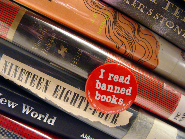
I'm sorry that my score suffered for the glare from the plastic book jackets. I didn't take them off because I wanted it to be 100% clear that these are library books. You can go to the free public library anywhere and get books that not so long ago you may not have been allowed to read. Many are ones that kids in many schools across the country are still not allowed to read. That's the real freedom I was communicating here. The button was purchased at a bookstore in Denver, but it is available from //www.asja.org/store/button.php for only a dollar.
Awesome shot. Would never have thought of this. The button might be overkill though, but it definately defines the purpose of the shot. Great focus and neat colors! 8
very creative and good interpretation of the category - i agree with you on this topic. i like that you filled the frame with the subjects. the only thing that i might change is that the orange button has an orange color behind it - taking away from the button "standing out" in my opinion. Maybe try the blue New World book behind it to make it "jump out" more. but that's just a suggestion. nice work.
The photo is made by the button! Your meaning is clear and precise, and you achieved it so simply, without any special effects (so to speak). Love the tight crop, a border may have helped though. This is one of my favourites so far!
Clever, original idea (good selection of books!). I would have liked a better lighting, to get rid of those strong reflections on the plastic covers. If possible, I would have taken away the plastic covers altogether, to make the book titles more prominent.
Even though I'm not a member and can't vote on the challenge, I love this photo...especially since I have read every book in the pile that I could read the title on. Great look at freedom, IMO. Very nicely done!
Good composition. I like the angled interpretation but I wish the books were at more of a diagonal as the 1984 title almost reads correctly. I think rotating the image clockwise might help to maintain the accent that is normally created visually by presenting the image at an angle. The lights glaring off Catcher In The Rye (I assume) and off Lolita are a little distracting and I doubt you could have done much to compensate for that is post shot processing. Perhaps a polarizing filter or a diffused light source would have helped that effect. 7
America's puritanism astounds me sometimes. All great books!
Shame about the glare on the spines of the books though... great concept but the idea doesn't translate into a good picture here. 5
This is a most refreshing interpretation of the challenge. The freedom of speech, or rather the right to free expression, begins with thoughts & ideas becoming speech and the edifying, enduring written word. Surely the awakening of the consciousness through stimulation of the imagination is the final indelible form in which these ideas take root, made ethereal again, and passed on, in speech.
The red button serves as warning, hanging seemingly weightless in front of these mighty books, itself a simple manifestation of ideas. It asserts but does not preach, a token and an offering. At its core, this is an excellent combination of elements, although there is room for improvement, from a photographic standpoint.
(Technically, there is a bit too much glare along some of the spines. The colours in the books do not contribute so much to the shot I think, although the red of the button is necessary. Outside of dpc, it might be nice to desaturate all but the red button; you might even get a nice effect in a dpc-legal way.)





 Add photograph to your favorites
 Add photographer to your favorites

 Photographer found comment helpful.


