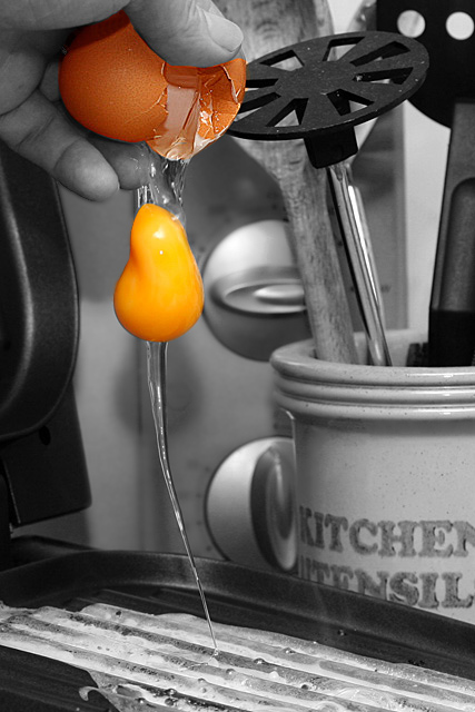
17th Place...not bad ;) I really liked the selective desat and you have certainly 'stopped motion' really well, I like the slight twist in the yolk too. I'd have to agree that the B/G is a little distracting but all in all this is a great idea well executed ;o)
Wow, the one 10 I gave in the challenge and only 17th place. Not a bad score, but really this was a great shot and should have ribboned. Again, great photo.
The weird thing though, as I look at this, I get a strange sense that the yolk is RISING INTO the shell, instead of falling from it. Kind of like I'm watching a video of it is reverse. Strange, I know.
this is a tough shot to pull off. it will be interesting to see how others react to it. i kinda like it, but am not too crazy about the shadows and the desatting.
Well this is certainly a unique egg shot. ;^) Don't think I've ever seen one quite like this. Good image for doing the selective desat...works well here. Have stopped all motion quite effectively. Should do ok with this one. Good luck.
Very good setup - good background items without being too busy. Nice job of stopping the motion. Not sure I like the use of selective desat; in color it might be good for a stock photo.
"Great Job" from the "Great Job Baggie"! I originally gave you an 8 on this shot. After 2nd pass through, I'm changing that score to a 10. I love the black and white of the photo with the exception of the eggshell and yolk. There is nothing technically that I can pick apart in this shot. It is quite lovely. Although this is a subject that is limited in it's appeal to those interested in cooking, it's beauty and originality is undeniable. I can see this in poster size hanging on the wall of a breakfast place. You deserve the 10 that I'm giving you.
it's a very likeable idea, this, and a nicely creative take on the challenge. for the most part, i like the idea of the selective desat, though i would have probably made the shell B&W as well, for the following reasons:
principally because the colour of the shell looks a bit odd.
the area of colour would be more centred (feels a bit unbalanced with all the interesting colour stuff up the top)
the shell detracts from the wonderful yellowness of the yolk; so bright and smooth and really fab
also, the only other real criticism is that the background has a bit of a conflict of ages. there's too much stuff (i think a simple plain or tiled background might be more effective and less distracting), though i love the utensil jar (looks rustic and old) but not too keen on the black circular implement (i get totally lost in the kitchen, don't know what it is) and the modern electrical appliance at the back. also, might have cropped above the tray... ANYway, none of that doesn't mean i don't like it, i do! i think it's cute, it's been greatly captured and timed, fits the challenge really well, and the desat against the yellow is really cool. 7.
Oh i like this shot. i think the selective desat plays a good role here but you need a better title, though that may seem a detail.
I love how the yolk's shape is distorted by gravity.
I personally love picking one or two items to keep in color with everything else b&w. I would however, suggest zooming in during edit and make sure you have all of the shell selected so you get everything.







 Add photograph to your favorites
 Add photographer to your favorites

 Photographer found comment helpful.


