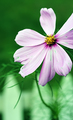
I'm sorry but.. I didn't get the subject of the photo..
is it the leaf or the petal..
Its a little too confusing for me.. :)
Having said that.. I would still use this photo as a wallpaper or even as an "interview-photo" to get the candidate interpret the photo as to what they make out of it..
It's pretty "thought" provoking!
....I see pleasing hot red as a lead-in & anchor to a good composition utterly without naïveté - a basic design element that persuades the eye to explore the nuance.
I could play with toning down the red petal. the light areas around the leaf are water. the leaf is floating in water. I turned the picture sideways. :)
A good abstract, I like the focus on the leaf but find the red petal? a little overpowering. Also there is a a light colours area around the stork of the leaf, is this editing or just the way the B/G was? :o)







 Add photograph to your favorites
 Add photographer to your favorites

 Photographer found comment helpful.


