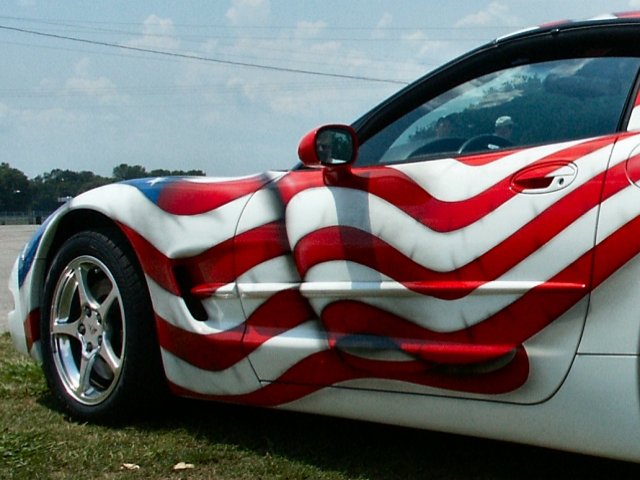
I think you could have improved this image a lot in your 'digital darkroom' I am probably not the first to say "Why did you leave those ugly wires in the sky?" and the half eaten sandwich or piece of junk on the grass could have gone too, Use the clone tool to paint sky and grass and the image looks much better, it's a shame to have that stuff detract from the subject. Also is that a self portrait in the wing mirror? I think it might be. ...and the two boys with hats on peeping over the dash! All this stuff could easily be hidden or disguised with a couple minutes work. What's the point of doing digital photos if you don't make use of the tools on offer to turn a good pic into a better one.
Wow, I'll bet that paint job cost a few bucks! Nice capture, and I like the texture in the painted flag. The power lines are a little distracting, but you probably had no choice there and we can't clone them out.
I see the texture of the car finish, of the grass, of the sky...and yes, the car is well-painted, but (perhaps since I'm a girl and cars seem to be a guy thing) the subject doesn't really do it for me. I likethe angle and the way the car is entering the frame. It's the subject that doesn't say Wow! TO ME
Composition9 Originality9 Technical Aspects6 Meets Challenge6 Total Score8
For those that are just learning, like me.
Composition: Scoring in this area is based on basic composition of a picture and includes the rule of thirds, balance, cropping, and curved and diagonal lines. Subject matter that does not lend itself to the picture or otherwise unwanted is also considered here.
Originality: Scoring in this area is based on pictures or concepts that I have seen, as well as how much effort you have invested in the picture. Usually a little something that sets it aside from a snapshot. Does it make me want to come back for another look? You know things like that.
Technical Aspects: Focus, exposure, lighting, and other special effects (done by the camera), and post processing are all considered in this category.
Meets Challenge: This is based on my interpretation of if you, have/have not, met the challenge. This is fairly simple but quite important for this site.
There are many sites that can give you assistance in achieving better skills in photography, but I think the best way to learn is to take pictures and show them to other people. Believe me when it is a good one you will know it.
I know that the flag painted on the car is implied texture but I just can't see where this meets the challenge very well. Also, you need to watch your background for telephone wires and such..maybe if you had shot it a little closer to the car.
I like this photo, in general. The face in the mirror, is that u? If so, kinda cool, if not, lump in with the next comment. The two extra faces in the window not good. If they were activily engaged with the car, that would be another thing. Next, the texture, everything has texture, but this is a bit of an odd mix. The paint is smooooth, right? The flag is painted is if it were fluttering. (Not really certain were I am going with this, bear with me, just odd) Isn't that more than technically somebody else's work? (canvas=car) And then there are the power lines...... 5 Swash
hm. this is an interesting take on texture, and i'm not quite sure what to think of it. the texture of the flag is really not there. apart from that (and, btw, NICE car!) you could have chosen better as to where to photograph this car (unless of course it isn't yours so you couldn't move it). the powerlines at the top, and the parking lot to the left are not the best places to show off the car. just my 2cents. -- gr8photos (3)
Good placement of the subject but the power lines are distracting and much more imoprtantly I don't see any possible connection to the theme here. 2-ClubJuggle.







 Add photograph to your favorites
 Add photographer to your favorites


