Hello from the Critique Club,
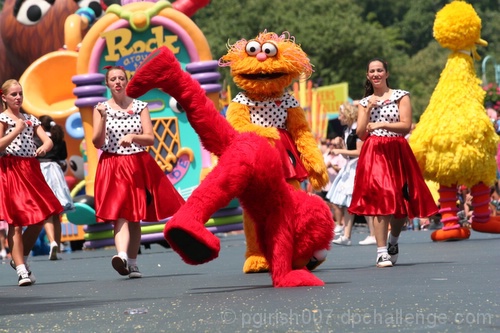
I remember this image from when I voted on the Action Shot II challenge. I gave you a 5 on this image because you definitely met the challenge but the image has a couple of technical shortcomings. First, the image appears to be tilted to the left and that always gets marked down score wise at DPC. If you would have used the roadway as your horizon and straighten the image accordingly, your score would have been closer to the 5 I gave you. Second, Zoe has very sharp focus, while Elmo is not. Since Elmo is the subject with the most action, the viewer looks more to Elmo for sharpness than at Zoe. Lastly, I think the image could use a little adjustment in levels or with contrast and brightness. The colors in this image are wonderful but there isn't enough contrast and that makes the image look a little flat. If you have any questions regarding this critique, feel free to send me a PM.
Tim
|






 Add photograph to your favorites
 Add photographer to your favorites

 Photographer found comment helpful.


