Author Thread
Post actions
oh .. i rated this 10! 123th is not the right place :(
Comments Made During the Challenge
Post actions
Like your colour choice .. great idea!
Post actions
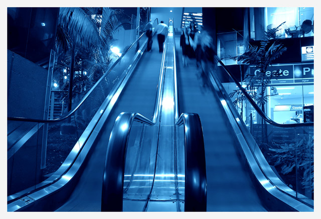
Shame its not quite symmetrical, seems tilted a bit to the right to me. I like the blue tint, makes it more interesting - 8
Post actions
I like the blueish corporate tone to this photo.
Post actions
I think this is a good idea but the action is such a small part of the shot and there's so few people that it doesn't really give the sense of bustle.
Post actions
This shot reminds me of a billboard type ad, or something you might see on the side of a bus or at the bus stop. ;^) Like the cool blue tone. The only problem I see with this image is the "Bustle" isn't bustling too much - need more people! Good luck in the challenge.
Post actions
Post actions
It is a better picture if you could reduce White glares.
Post actions
For a title that says "bustle" there really isn't a whole lot of people on the escalator. Good picture, but not enough action for my liking.






 Add photograph to your favorites
 Add photographer to your favorites

 Photographer found comment helpful.


