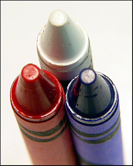
My first impression of the picture - poor focus and simple concept we've all seen 100 times. Some commented a black background might have been better, I'm not so sure, because then the darker colors wouldn't have contrasted, so maybe a different background, but I'm not sure what color would've worked best. The actual positioning of the crayons wasn't so bad, you just needed focus. I would recommend never submitting a photo this poorly focused, you can always reshoot until you get focus, that's one of the advantages we have using digital.
Sorry I have so little good to say, but, I'm trying to help you out, not just to say nice things so I don't hurt your feelings. Just keep shooting and try to learn from mistakes.
I like the perspective and concept here. Also, the thought that with these three colors, anything can be be created, including the flags of several countries... a good concept of freedom. Depth of field was some thing you used here, but I don't know that it adds anything to the party (blurred bottom of crayons). 8
I like the idea. I would've cleaned up the crayons or bought new ones. Maybe try this on a black background to make the white stand out? A wider range of focus would've been nice, too, as the tips are kinda blurry.
Nice closeup of the three crayons. It really shows the waxyness of the crayons. The shadows and reflections really make them pop out. The white background really helps it pop out too. You can almost feel the texture of the fibers in the paper. Great shot.






 Add photograph to your favorites
 Add photographer to your favorites

 Photographer found comment helpful.


