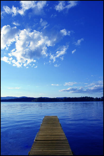
First impression: The colors are not right. The water is to blue. Most of the frame is filled with the sky but the title is about the water.
Things that would improve the score: Rethink the composition and the pov. I'm thinking that a lower pov would make the pier more dominant in the picture. Maybe a more subtle color enhancement in post processing. What really throws me off is the difference in the color cast of the pier and the water. If the sky and water was that blue, the pier would also carry a blue tint. It looks greenish to me. I think that's why the water looks to blue.
I like this very much. This is a valid case for a centered composition. Works well. I think you went a bit overboard on the blue saturation however. Good luck in the challenge.






 Add photograph to your favorites
 Add photographer to your favorites


