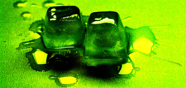
The colors are harsh and don't inspire a feeling of calmness. Can't really tell what it is under the ice either. I normally like this color combination. Maybe if the colors were more muted and the light more even, it would be better.
Hmmm... how to vote this one. Difficult. Although I don't feel too much of a sense of quiet or peacefullness, it seems as though it is broken up by the splash look of the water. It is a work of duality, the hardness of the surface, and the softer, melting ice. The color is gorgeous. Great job from the "Great job Baggie"...
I like the idea of the melting ice cubes, but the coloring is just too intense for me... some cooler shades of blue would have worked well I think to portray the simple silence of a zen challenge.




 Add photograph to your favorites
 Add photographer to your favorites


 Photographer found comment helpful.


