|
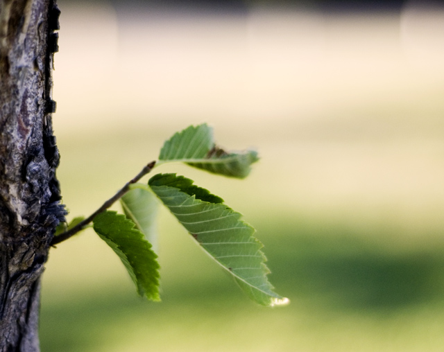
Good contrasts in texture and size. I think the play of the small twig versus the negative space works well and bring a sense of zen. I think the focus is a bit off though, a sharper focus would really help set the twig off from the background (which kind of makes it meld in since the colors are very similar). The white light on a drop? or something is a bit distracting too. Since it doesn't seem to be an important aspect of the image (due to its out of focus nature) its brightness does draw the eye away from the leaves as a whole. I think cropping it just a bit at the top so the dark portions were gone might help as well. I gave a 4 |







 Add photograph to your favorites
 Add photographer to your favorites


 Photographer found comment helpful.


