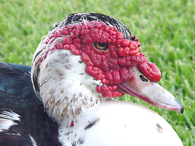
Shows texture for sure! Poor thing...by comparison, what I see in the mirror isn't so bad! Thanks for revealing that! The white chest is distracting but it's still a good picture.
Composition9 Originality9 Technical Aspects10 Meets Challenge10 Total Score10
For those that are just learning, like me.
Composition: Scoring in this area is based on basic composition of a picture and includes the rule of thirds, balance, cropping, and curved and diagonal lines. Subject matter that does not lend itself to the picture or otherwise unwanted is also considered here.
Originality: Scoring in this area is based on pictures or concepts that I have seen, as well as how much effort you have invested in the picture. Usually a little something that sets it aside from a snapshot. Does it make me want to come back for another look? You know things like that.
Technical Aspects: Focus, exposure, lighting, and other special effects (done by the camera), and post processing are all considered in this category.
Meets Challenge: This is based on my interpretation of if you, have/have not, met the challenge. This is fairly simple but quite important for this site.
There are many sites that can give you assistance in achieving better skills in photography, but I think the best way to learn is to take pictures and show them to other people. Believe me when it is a good one you will know it.
Oh, Good Lord!!! I feel better looking in the mirror already!! ;-) Is he/she supposed to look like this? Yikes. Clear, good DOF, excellent texture. Maybe the saturation could be tweeked a bit because the red is a tad dull/grey. (9)
This looks like a cross between a duck and a pomegranate. I?ve never seen a textured creature like this before ? Thanks for sharing this with us. This looks slightly over exposed for my taste, but everything else is great. DOF, composition, framing and certainly showing an odd texture.
I hate those ducks. THey are the scourge of the earth. This ducks chest is over exposed. Look at how its all white and has no texutre in it compared to the area just to the left of center on the bottom.
wow.. now that's an ugly bird :) This is a nice choice of texture for sure... I think the exposure is a little hot on the chest feather area.. it's hard to get white details in bright light... = 6 - jmsetzler






 Add photograph to your favorites
 Add photographer to your favorites


