i think this is a fine idea for zen, and you captured a good scene.
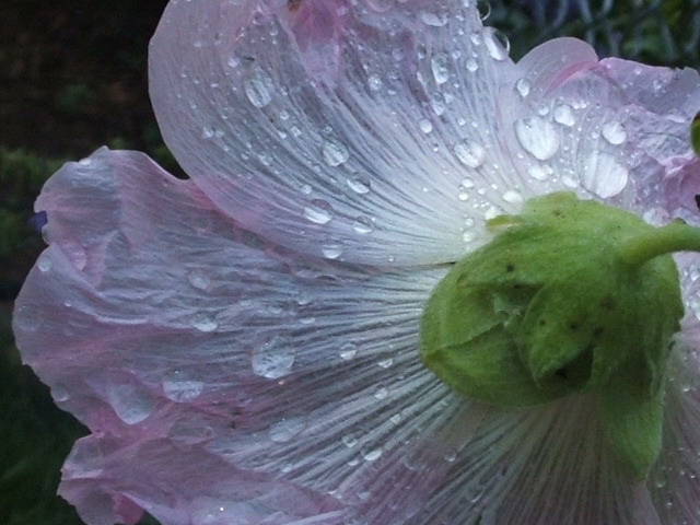
technically, however, i think the shot is lacking. first and foremost, it seems out of focus. focus is the number one thing most voters look for at dpc. if the shot is not totally bad, you can make it sharper with an unsharp mask.
the colors seem washed out overall. a contrast boost will make the colors pop more and really make the photo stand out.
finally, i'd spend a little time with the clone stamp tool and work on cleaning up the spots on the base of the flower (the green part). although they're insignificant to you, they are pretty prominent in the macro and can be removed in an advanced editing challenge.
This is a beautiful, natural, subtle shot. I like the lighting. The texture and pastels of it remind me of a young girl's Spring dress. Sure, you could run it through noise reduction once or twice to smooth the grain, but I think it would be wacky to up the contrast, sat and sharpness to dpc standards. That's not what this picture is about.
Neat idea, however I think you're going to get hammered a bit for a few things. 1) It's a flower. 2) It's a flower with water beads on it. 3) The color isn't saturated enough. 4) It's a bit noisy.
Don't shoot the messenger. ;^) I've done a flower shot or two in my time. He-he. Good luck!






 Add photograph to your favorites
 Add photographer to your favorites

 Photographer found comment helpful.


