Thanks for the critiqueing comments, they were all true and very helpful. I will try to spend more time in perfecting the post processing and not do literally last 5-minute submissions.
The Challenge-Details seem to disapear, but I save each one.
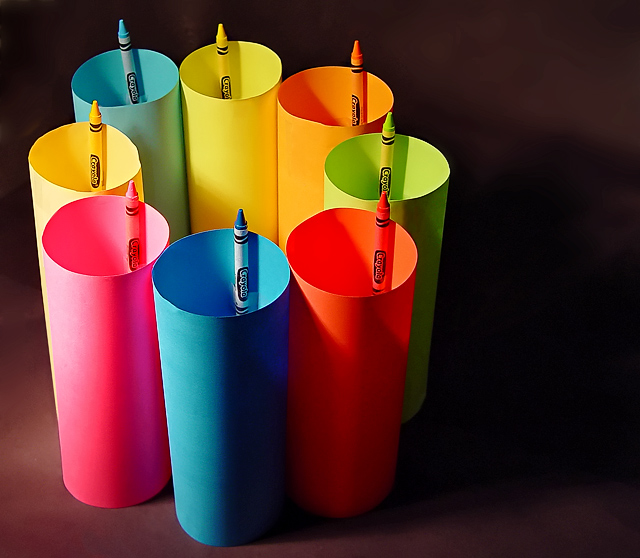
Yes it did say subject(s), but to be 100 percent accurate, the word background shouls have been plural also.
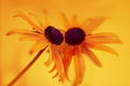
"Take a picture of a colored subject or subjects on the same color background"
"Roses and Friends" in the 21st place also interpreted it in a similar fashion.
Ohh.
Nice creativity.
I don't like the fact that there's two yellows.
For some reason, it just bothers me.
other than that, the light seems to be a little bit harsh on the yellow/pink.
And i would've liked a totally black background better.
Good luck though.
-8
Very creative idea. A well lit, very sharp, vibrant presentation. I see where you're going with the off centered comp, and slight negative space, but I get a slightly un balanced feel. I'm wondering if perhaps it is in a spot where (as far as the negative space) it is wanting either a little bit more, or a little bit less, to achieve a slightly stronger 'balance'. A good idea though, and technically well done.





 Add photograph to your favorites
 Add photographer to your favorites


 Photographer found comment helpful.


