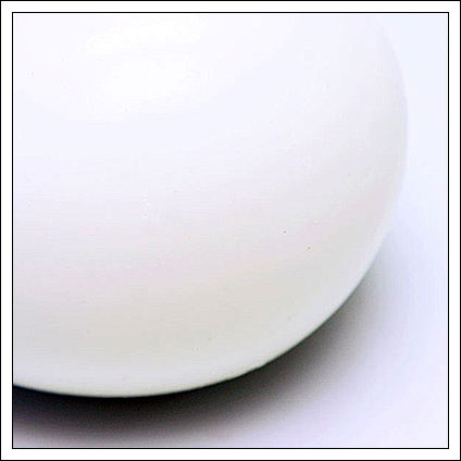
I like the curve in this one. too bad about the 3 small black dots on the egg, make it a bit less clean. it was advanced, so you could've clone them out ;-)
The abstract isn't bad. One, if possible, always make sure you have as near 640px on one side as possible. Lots of people vote lower for smaller pictures just because. This is in the middle so I don't know how much it hurt you. There are tutorials if you are having trouble with getting a full 640px shot at 150kb.
I do like the geometry of the shot, but perhaps I would have gone for just a tiny bit more definition at the upper edges of the egg. On my monitor (which is a laptop and so has some limitations) the egg is totally lost at the top and my eye doesn't quite like that as much.
Also just be aware that abstracts tend to do poorly at DPC outside of an actual abstract challenge. That shouldn't stop you, but it just helps answer the question of why your score was where it is.
(1) I would like to see a sharper line at the egg's edge where it meets the shadow/
(2) Take advantage of the full 640x640 allowance. Not doing so tends to get voted down around here, probably because it indicates a lack of knowledge on how to use your photo editing software? I'm guessing at the reason, but especially on a black and white photo, with very little color data to inflate your file size, there was no reason that a 640x640 couldn't be saved at 100% using Save for Web.
I have 3 complaints about this image, which could have been made better with just a little better post-processing.
1.) Noise. That pretty much speaks for itself.
2.) Border. The white of the border makes the background look incredibly cyan.
3.) Size of the image. The maximum size of an image on DPC is 640x640. Use that to your advantage.
Without those post-processing flaws, I tell you, that it could have been a 8 or a 9. It's a great graphical work, with great composition.
The problem I see with this photo is there is pink banding towards the bottom of the egg, which (I'm guessing) has been introduced during the saving for web process. Bit unfortunate as it is distractingly unreal to me.
This is a brave and subtle treatment of an egg. The blue mist shadow is precisely the sort of thing I was hoping to see when I set out to vote. It skates near the edge of being too little or too pale or too closely cropped, but does not cross it. Nice.







 Add photograph to your favorites
 Add photographer to your favorites

 Photographer found comment helpful.


