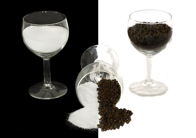
Well, this was one I put a bit more effort into, but unfortunately, it turns out glass isn't the easiest to work with, and i've got to learn how. I realise the pepper isn't actually black also, but i'm hoping it's "black" enough in symbolicness. Oh yea, and to get the salt and pepper seperated in the middle glass i just stuck a piece of paper in, poured the salt in one side, pepper in the other, then "spilt" it, then pulled the bit of paper out, and using a pocket knife, just cleaned it up a little
Anyone wanna teach me how to shoot glass images? :)
PP includes
- raw conversion w/colour correction
- fix rotation/crop
- levels
- significant amounts of cloning to get background proper black and white
- slight darkening of pepper, and lightening of salt with dodge/burn
Statistics
Place: 15 out of 263 Avg (all users): 6.3670 Avg (commenters): 7.6667 Avg (participants): 6.1398 Avg (non-participants): 6.4885 Views since voting: 1588 Views during voting: 412 Votes: 267 Comments: 17 Favorites: 0
thanks for all the comments guys, especially the one about sea salt crystals... i was too busy thinking how to use something other than pepper thats smaller to match the salt, but didn't think of using rock salt instead and keeping the pepper :(
Ah well, my best finish so far, and hopefully there'll be better finishes to come :)
Metiulously (too lazy to look up the correct spelling) done. It's a really great graphical work. The exactness of how far the glasses on either side of the spilt one, how full they are, etc.
The only problems with this image are these:
Personally, I would like the spilt one to be a little more exactly split in the middle of the backgrounds. Not easy to do, just a little nitpicky thing I have.
And the lighting/reflections. I've done shots of glasses before, or at least attempted to, and I know that this, too, is in no way easy. The one on the right looks a bit better than the one on the left, just because of the background being white.
Oh, and the glass in the middle? Try spot shining the black side of the bottom of the glass, it would make it look a little cleaner.
Overall? I give this a 7. I may change it to an 8 later today, I'm sort of on the fence.
It's a shame that the stem of the glass on the right is a bit washed out. and the black/white background looks just a tad too much like it's completely a product of photoshop. But that's just nitpicking - overall it works well.





 Add photograph to your favorites
 Add photographer to your favorites

 Photographer found comment helpful.


