|
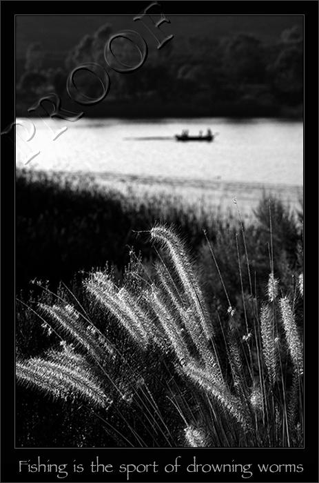
I'm going to have to agree with xion - picture's great, but the text needs work! Text is just as much a graphic element as the photograph itself... a more subdued font (e.g., narrower characters, lower height for the letters with long stems like 'd' and 'h') with more tracking and more space to breathe would, I think, communicate more elegantly. |




 Add photograph to your favorites
 Add photographer to your favorites

 Photographer found comment helpful.


