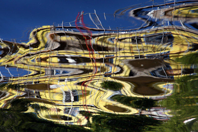
This is the reflection in the river of a building under construction in downtown San Antonio. I kinda liked the abstract nature of it. I fully expect the DNMC vote saying it\'s more yellow than gold. That be OK.
Post processing - rotate 180 degrees, autolevels, hue/sat, clone a few bits of white stuff out of the water, sharpen, resize. This is from the small jpeg that accompanies the RAW file.
Statistics
Place: 134 out of 296 Avg (all users): 5.3636 Avg (commenters): 6.8000 Avg (participants): 5.2564 Avg (non-participants): 5.5429 Views since voting: 913 Views during voting: 276 Votes: 187 Comments: 17 Favorites: 0
Nice abstract with interesting lines and shapes, and good colour. Water-reflected abstracts are among my favourite, and this is well done. I like the dark patch of blue upper left, which for counter-balances all the activity below it.
Trading Post - This one didnt grab me Deb. I knew it was a funky reflection but it didnt really grab my attention. Cool swirls and the colors are ok (gold is a bit of a stretch) just not the shot for me (hey I am your customer right? :). Get back up into your 6s and lets see you crack that top 10!
Trading post...
Great abstract. I wouldn't know what the reflection is of without the explanation. The gold colors are very good. The only detraction is the red lines right in the middle. I can't figure out if they are also part of the reflection or something in the water. But, if you could get rid of them it would be so much better.
I gave this a 9 - it was gold, and it was beautiful in my eyes and on my monitor. I'm a sucker for swirly water reflections, though. The colors really are exquisite. Nice job!
What I liked about this image is your creativity and the overall design of the photo. Despite the obvious effects of reflections in water, the shot is clear and technically well made. I scored this a 5 and struggled to rate it higher. However on my monitor the building looks yellow to beige rather than gold. (I hope it's not my monitor. I don't think it is because calibration information suggests it's ok.) In the end, I stuck with 5 because I liked the image but felt it wasn't really "gold". (no DNMC, just a shade off.)
I'm not normally too big a fan of abstract, but this one is so pretty. And perfect for this challenge. The reflection has such energy for such waters that would show it. Amazing.





 Add photograph to your favorites
 Add photographer to your favorites

 Photographer found comment helpful.


