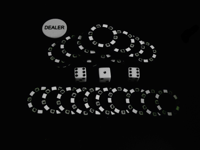
Lighting was done with my normal 60w soft white lamp, held just to the right of the shot. And I though that this would be an interesting shot. I did have to burn out a small portion of the desk, as it was scratched. Brightness/contrast mask.
I was going for the black mixing in with the background and the white coming off of that.
//www.dpchallenge.com/image.php?IMAGE_ID=370600 I didn't want the alternating white and black look. I wanted the feel of the white popping off the black background.
Statistics
Place: 144 out of 263 Avg (all users): 5.0323 Avg (commenters): 5.5000 Avg (participants): 5.0235 Avg (non-participants): 5.0368 Views since voting: 1099 Views during voting: 342 Votes: 248 Comments: 13 Favorites: 0
Another response from your forum post. You've already heard about the contrast issue so I thought I would add one more item as food for thought. The way you stacked the chips gives this image a lot of potential for patterns if cropped differently. As is, the image is all about symmetry, which is slightly off. If you crop tightly around the dice (About a dice width to the right and left of the end dice) and intersect the chips with the top and bottom borders of the image, the dice become the focal point of the image but the pattern from the chips add a lot of eye appeal. I often play around with cropping to see how much different looks I can get from an image.
You posted in the forums that you were looking for comments on how to improve... so here goes.
When I look at this photo, it doesn't scream wow to me. It's a very contrived set up and for taking so much time to set it up, I'd think you'd have been a bit more careful about making it more precise. The spacings on the bottom row are uneven, and the dice are slanted at slightly different angles. With such a symmetrical type of shot, any deviation from an exact setup draws attention to itself I think.
The lighting was good for what you were trying to achieve, but as others commented, a bit more contrast might have helped. You also lost some light down in that lower corner, which also draws attention to itself.
Overall, it's just kind of a flat shot. Meets the challenge, was a creative idea as far as technique, but just not executed as well as it could have been.
As symmetrical as you tried to achieve, the top chip set is slanted the opposite of the bottom chip set. The dice are not evenly spaced. The concept and execution are good except as noted. I do like the lighting and agree the contrast could have been boosted a bit.
There doesn't seem to be enough contrast between the black and white...seems a little dull.
I'd agree with this, need to bump up the contrast... also, the shot seems too "posed" and too far off to the top right... also you have shadows on the bottom row of chips and nowhere else so it looks out of place.
I would've just tossed the pieces onto the table and shot from table height perspective to try to give this some more interest... good camera work with the lighting, though it's hard to tell what is in focus and what is not because it's so flat
I think this is a good shot - you definitely achieved the white popping off the background as you desired. I agree that it could be improved upon but of course most photos can :-)





 Add photograph to your favorites
 Add photographer to your favorites

 Photographer found comment helpful.


