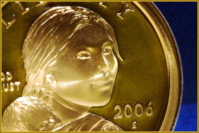
I'm not sure if voters outside of the USA are going to be familiar with this coin. If not, I expect to be punished with lower scores. It\'s one of my favorite coins and I was glad DCP gave me a reason to take a some photos of it.
Statistics
Place: 261 out of 296 Avg (all users): 4.6350 Avg (commenters): 5.2857 Avg (participants): 4.5042 Avg (non-participants): 4.8272 Views since voting: 832 Views during voting: 285 Votes: 200 Comments: 8 Favorites: 0
Ah, this is so close to being a really nice picture. The focus is just a tad to shallow it seems since the 2006 is perfect, but not her face, although that could be due to the glare there. I like the idea of this macro and it more than meets the challenge to boot. But I really feel the lighting and / or focus around the subject's face is missing whatever the 2006 has got.
I'm not fond of this shot and here's why. The background should have been blurred a bit to hide the fabric it was on to bring more attention to the subject. The subject also looks to bright and not clear enough. The only thing thats looks super sharp is the date. I think a less powerful light source would have brought more detail to the person on the coin. Good luck in this challenge. <5>
I think you could have put more effort and thought into how you are going to frame and composite this image. it
Meeting the Challenge 0-1-2 = 2
Overall look, feel and composition 0-1-2 = 1
Creativity 0-1-2 = 0
Quality and execution 0-1-2 = 1
WOW effect and first impression 0-1-2 = 0







 Add photograph to your favorites
 Add photographer to your favorites


 Photographer found comment helpful.


