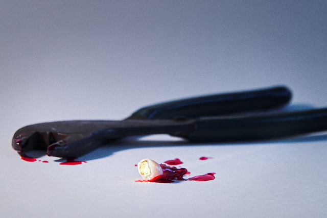
I hate the dentist... I'm glad there are others that do as well. Thanks to those that could see past the subject matter and judge it for what it is, for those of you that couldn't... you're comments make it all worth it!
USM
Hue/Saturation
Curves
Grain
Dodging and Burning
Statistics
Place: 270 out of 296 Avg (all users): 4.5078 Avg (commenters): 5.6190 Avg (participants): 4.3578 Avg (non-participants): 4.7024 Views since voting: 889 Views during voting: 307 Votes: 193 Comments: 27 Favorites: 0
I thought this was very clever. Probably a little too clever, since from the comments below it looks as though most people didn't get it.
And I can't believe some people thinking it deserved a brown ribbon - even with arguments of DNMC, it is still a decent photo.
Thanks for the laugh.
Made me wince. Great idea for a shot to bad the DNMC'ers gotcha. I agree with burning the gold in the tooth more and the blood is a little pink'ish in spots but none the less ROCKIN' SHOT! LMAO
Very nice concept and composition but the gold inlay in the tooth does not appear to be in sharp focus and to me that should be the focal point of the shot.
a first glance, it's hard to see the gold... like maybe the light was a little too bright on the left side (or my monitor needs calibration). :) very interesting take-- completely unique, as far as i can tell so far! nice coposition and focus, and good use of depth of field. not a picture i'd hang on my wall, but a nice challenge entry for thinking out of the box and executing it well.
I realllllly like this image, even if it is a little bizarre! Honestly, being sharper could help some, but its originality definitely makes up for technical details!! lol
Visible gold is at an absolute minimum, but the "meet the challenge" is at a maximum, I like how you saw this challenge. Very creative and good technicals.
Interesting idea. The gold has been edited out of the shot with the pliers? The only negative for me is the color of the blood. It looks to pink and watery.





 Add photograph to your favorites
 Add photographer to your favorites

 Photographer found comment helpful.


