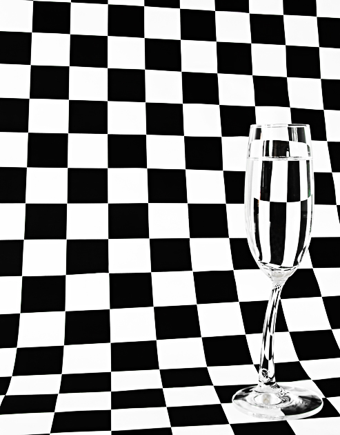
VERY annoyed! I spent ages printing A4 pages of checked paper, cutting and pasting them together to get a seamless background. I was pleased and thought that would be the hard part. Could I find black and white chess pieces?? NO! Black and brown, dark brown and light brown, black and silver! No time to paint a cheap set, and then this idea hit me! It is a tribute to bille II by ehosca
.
Shot in RAW and used a trial verison of Capture One Pro to adjust white balance, levels and exposure.
PP in PSCS:
Cropped
Spot edited some glue marks in the right
Hue/Sat adjustment layer to de-set the blues and cyans (poor lighting setup left a bad blue colorcast on the white parts of the paper. I got this OKed by SC before submitting!)
Curves adjustment layer to boost contrast.
Run through Neat Image.
Resize and save for web, cross my fingers and pray!
Statistics
Place: 44 out of 263 Avg (all users): 5.8601 Avg (commenters): 6.1818 Avg (participants): 5.7470 Avg (non-participants): 5.9188 Views since voting: 1086 Views during voting: 406 Votes: 243 Comments: 17 Favorites: 0
First, I really appreciate including the photographer's comments - I find it both educational and enjoyable to read about how people set up, execute, and process their shots. Second, I'm quite impressed with the effort you put into creating the paper!
This is a good variation on a repeated theme here at DPC. The fact you've curved the background and not lined it up completely square/straight seemed to bother some commenters. To me, though, it seems quite complementary to the curves of the glass and adds an element of interest that wouldn't be there with perfectly straight lines.
I'll agree with one commenter that it's nice not to have the glass centered, but will also agree that I find it a bit too close to the right side of the frame.
Lighting is good - even if it was something you corrected in post processing - the final product shows no colorcast, no obvious underlit or overlit areas.
There are some visible 'jaggies' but I've yet to find a way to recommend to you to avoid those with very distinct lines presented on a video screen. These are not overly distracting, though.
A good finish and a nice addition to your top row on your profile page.
Boy this has become cliche. Anyway, in this case your glass seems too far to the right and the line of your background are more distracting than anything because they aren't even close to straight. Sorry, just the way I see it.
Okay, I'll be perfectly honest. In the thumbnail, it looked very "wow", but then on the large version, not so good. The lines weren't even trying to be straight, and I usually think on this type of photo, they need to be. I see how maybe (and this is just my guess), that you thought that the checkers should be askew because of the stem of the glass not being straight. I personally think one or the other is enough--you don't need both to be not straight on a type of photo like this.
Clever photo and title...to bad it's the truth. Living in Las Vegas and working in Emergency Medicine...we get a lot of calls for people whom have had their drinks 'spiked' with other then alcohol.





 Add photograph to your favorites
 Add photographer to your favorites


 Photographer found comment helpful.


