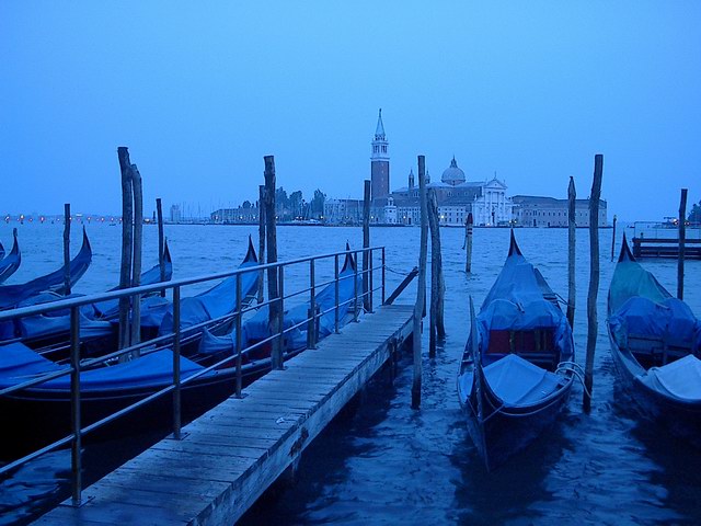
The subject is great, the colour is good, the textures are helpful. The lights are a bit distracting. As are the posts, if you could I would have tried to frame it so that the tower was not obstructed at all, however despite all that, a very nice photo.
This reminds me of my high school's senior class trip to Italy. I stood right where this photographer stood about 2 and 1/2 years ago. I was taken back to that day in Venice the moment I laid eyes on this photo. . .to how child like I felt while there and to how much I wanted to take this city in because I did not know when, if ever, I would return. Basicly, it touched me and I love it for that.
I like the tone and color of this shot, I might have rated it higher if the angle were steeper showing the building in background without poles in front of it.
This is wretched. If you are going to make something with THIS MUCH BLUE then you need to get rid of any and all yellow!!!!!!!!!!!!!!!!!!!!!!!!!!!!!!!!!!!!!!!!!! My eye is first drawn to the tower (good), but a milisecond later I see the string of lights on the left (bad, bad, bad). If you want it this blue, then just desaturate the damn thing, add a level of blue, and stop.





 Add photograph to your favorites
 Add photographer to your favorites

 Photographer found comment helpful.


