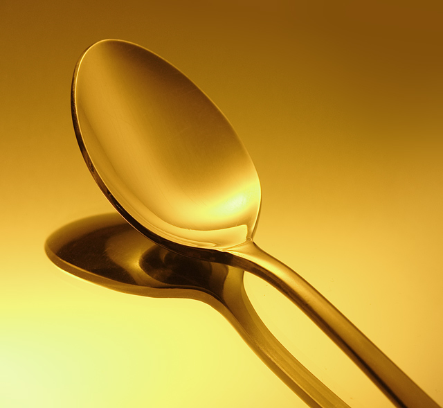
Taking a cue from Keith Maniac here. I followed his basic setup, and will avoid making further comparisons to his stellar image.
The coloration was largely done in-camera, by taking a picture of a blue chair and setting a custom white balance based on that blue. I actually had to cool the color a bit in Photoshop.
Other than color and saturation adjustments, the image is pretty much straight out of the camera... no levels, no curves, nothing!
I foresee trouble on two counts:
1. guessing people might not like the obvious coloration, though i'm also guessing that there will be quite a few images colorized to gold.
2. as in the pink challenge, getting a color that looks right on everyone's monitor is HARD! the photo has a lovely golden tone on my primary monitor, but on other monitors, it doesn't always look so good. i wouldn't be surprised if i get a lot of comments telling me that this looks yellow or orange.
--
I am delighted to have reached the top 10 in this difficult challenge. I thank you all for your high votes and thoughtful comments!
Statistics
Place: 9 out of 296 Avg (all users): 6.6410 Avg (commenters): 7.9167 Avg (participants): 6.5517 Avg (non-participants): 6.7722 Views since voting: 2480 Views during voting: 306 Votes: 195 Comments: 21 Favorites: 2 (view)
Congratulations, that's a great lighting technique to learn. My wife suggested to use our Gold-colored set of utensils. Nooo, I didn't listen to her and *hastely* did a humorous unique corkscrew.
If Humor isn't exceptional it seems its treated like an obnoxious child wanting attention. For excellent examples see top-winning advertising graphics.
I don't get it - how did the picture so well? It's a good picture, but even the photographer admitted he just copied another picture IDENTICALLY except for the colour, and even that was just from in camera fake colouration. Doesn't creativity and originality count for anything. How does it place in top 10?






 Add photograph to your favorites
 Add photographer to your favorites

 Photographer found comment helpful.


