I was pretty shocked when seeing the first two comments. I wasn't aware of the photo in the Games challenge. However, I think I would have submitted anyways when knowing in advance.
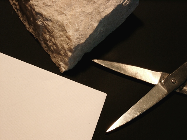
The glare on the scissors was intended. I wanted to show the cool, gleaming metal in contrast to the plain paper and the fractured rock. Actually the glare was what made me to submit this photo.
Very creative and different. I like the black background. I feel as if this needs something (not sure what though), I'm not getting that 'oooh' feeling. 7 ruthann
Neat idea, need to soften the light to kill the glare on the scissors. I would have tried to arrange the items more in contact with each other and tried to show which one beats which one... 6 nards656
Nice use of different textures, and a very simple, yet effective composition. My only nit would be that I wish the texture of the paper had been more obvious. karmat






 Add photograph to your favorites
 Add photographer to your favorites


 Photographer found comment helpful.


