Author Thread Comments Made During the Challenge
Post actions
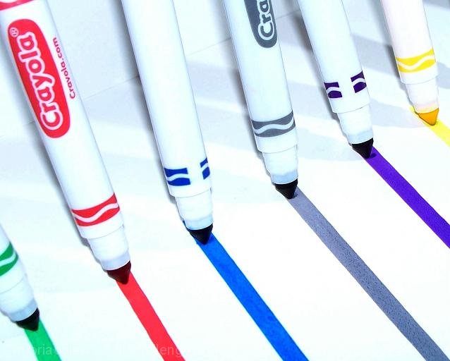
I like the lines. But would have looked better if the crayola markers should either be every, or all the same direction.
Post actions
I wonder what this would have looked like with more pronounced shadows ( off the markers ). Good concept.
Post actions
Post actions
It would be even better in my opinion if all the markers were facing the camera on the same side (i.e. either with or without the logo).
Post actions
Post actions
Needs either more contrast (really push it), or less blown out. It hits a middling ground that doesn't quite work.
Post actions
Nice concept and nice angle. It's too bad the markers weren't all facing the same way. It might have enhanced the visual rhythm.
Post actions
Enter your comment here, and then cast javascript: do_vote(5)
Post actions
The amount of white is almost overwhelming to my eye.
Post actions
lighting and focus need improvement here,,,to pull off a shot like this, you need to make sure all of the pens are perfect...the last two are skewed here...also it is obvious you drew the lines then leant the pens against something...good effort, points for effort here...







 Add photograph to your favorites
 Add photographer to your favorites


 Photographer found comment helpful.


