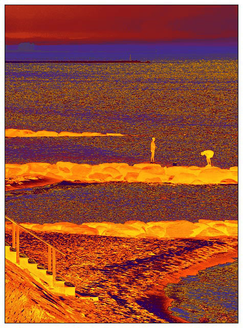
A lot less PP than it looks like; straight grayscale conversion, gradient map adjustment layer applied, crop from top a little; that's it.
I am sure this is doomed but I am very fond of it and I came up with nothing better. My idea was fixed in my mind; the challenge title is "On the Beach", and this made me think of the great Nevil Shute post-nuclear-war novel and the movie of the same title. I wanted this "post-apocalyptic" feel, and I think I got that :-)
Odd sidelight: the horizon of sea/sky is actually where the blue stops and the maroon starts. Look closely and see a large building op there on the left. The gardient flipped the values there for some reason :-)
Statistics
Place: 312 out of 326 Avg (all users): 3.9930 Avg (commenters): 4.6000 Avg (participants): 3.8218 Avg (non-participants): 4.0865 Views since voting: 1754 Views during voting: 408 Votes: 286 Comments: 24 Favorites: 1 (view)
Good Grief! As as big fan of Nevil Shute's work, and even with the huge hint in your title, I never made the connection. Not how I thought of the setting for his Down Under, extremely compelling novel.
Glad to have another chance to look at this image.
Oh good god - what happened, Bear? I didn't vote on "beach" by the way.
Hey, at least yours isn't DQ'ed like mine did, LOL.
Anyway, I won't say I like this shot because I'm not sure if I liked it, but after reading your description, I do agree that it has got that 70's hippy kinda colours and look. Cool effects - this one I'd give ya ;)
Interesting take and definitely something different. Though the title does explain the post processing, I sometimes wonder how many viewers do get the references in images like this.







 Add photograph to your favorites
 Add photographer to your favorites

 Photographer found comment helpful.


