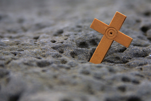
Shouldn't this have been CruCifixion? Foreground is badly out of focus. Might have been better if you had cropped the picture at the bottom of the cross and shown some more detail of the cross. A bit lifeless the way it is.
love the limited dof and the combination of rock and wood. I found myself wishing for a little more to the cross to give it a 10...I gave it a 9-1/2..:-)..hokie
The composition on this photo is excellent... I would really be drooling on this one with a greater depth of field to bring this surface into sharper focus... good shot :) = 7 - jmsetzler
From one narrow DOF to another, like this. By having the foreground blurred, and the background blurred, the cross is really emphasized. The colors are a little drab to me, but that is a personal thing. karmat







 Add photograph to your favorites
 Add photographer to your favorites


