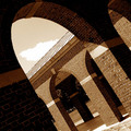
distracting white area at bottom right (from rotating?). Good tones, but IMO needs a litttle more space at right, huge part of building at left might have been cropped off
the building on the left of the image is leaning into the image and is a bit distracting to me, otherwise if it were straighter then the lighthouse might be leaning in the other way if you used a wide angle lens here. really like the tones here. -7






 Add photograph to your favorites
 Add photographer to your favorites


 Photographer found comment helpful.


