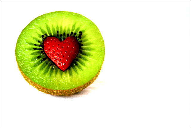
This Image took SOOOO much! Not the actual set up or the shoot, but the editing! It wouldn’t have been bad at all, but my new monitor was horribly calibrated. The image I was going to submit was completely different from the one I saw on my monitor. Thank god my browser wouldn’t upload my photo, because of that I had to view my image on an other computer. The set up was REALLY GREAT! One of my favs so far! Had alot of fun carving out the Kiwi to fit the strawberry. I don’t have much hope for this image, mainly because I’ve gone through about 5 edited versions, several hours of my time, and it would be to good to be true getting top 20 right? Lol, anyway, I’m really hoping that the Brightness, contrast and saturation aren’t too far off. Other than that, I’m happy!
---POST---
Thanks to everyone who's commented! I'm a little dissapointed because after the fact i got a new monitor and it looks a little off, But Thanks for making this my top score yet! :D
Statistics
Place: 33 out of 199 Avg (all users): 6.1429 Avg (commenters): 7.5000 Avg (participants): 5.8072 Avg (non-participants): 6.3507 Views since voting: 1977 Views during voting: 395 Votes: 217 Comments: 20 Favorites: 4 (view)
Hi Ben. First up, congratulations on your highest scoring image. I've always preferred the 'less is more' style of photograph and this is a classic example. You obviously put in a lot of effort to get this one.
The colours are striking and you resisted from the 'too much saturation' syndrome which can happen with images like this. I find the blacks of the seeds and around the strawberry seem a little strange looking, almost painted on. It could be from the PP perhaps.
Your framing and focus are good. I've been sitting here trying to look at your lighting as the shadow looks a bit wierd in that it seems 'cut off' on the edge. I could be just being picky here though.
All up, it's a great simple photo and it was received very well. Good stuff. Best of luck in your future challenges.
hey hey wazzup! :D glad I could finally have a chance to check up on the dpc stuff again. Congats on this! Highest rating yet and a 6! definately an accomplishment ;)
yeah, lets just say the burning around the strawberry didn't look ANYWHERE as bold on the screen i did the first edit on. Actualy, on my new *New* monitor, all my edited photos look a little dull. And this one... a little over processed :-( Thanks for your comments everyone!
Very DPC'ish. ;^) Clean, simple, well-focused, brightly colored. Great stock image. Yep - should do well with this one (if the Abstract DNMC folks don't getcha). Good luck in the challenge.
Yay! Ben!!! I signed onto msn at 10:30 and i was so happy to see you weren't online. Because that meant you'd submitted! Of course directly after i was uber depresso because you weren't online. I love it. It's sooooo wonderful. The colours are so wonderful and well a repeat of everything I said about it yesterday. LOVE IT.
Very creative. Possibly not what I think of when I think abstract, but that might just be me, so I'll give you the benefit of the doubt. Nice even lighting. Great title.





 Add photograph to your favorites
 Add photographer to your favorites

 Photographer found comment helpful.


