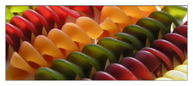
Anyway, it's wacky colored pasta shot in natural sunlight on table.
Cropped
Shadows and Highlights
Slight dodge and burn
minor cloning
neat image
unsharp mask
border
Statistics
Place: 16 out of 199 Avg (all users): 6.3973 Avg (commenters): 7.6154 Avg (participants): 6.1444 Avg (non-participants): 6.5672 Views since voting: 3296 Views during voting: 352 Votes: 224 Comments: 19 Favorites: 2 (view)
Greetings from the critique club. After looking over your photo I have some comments I'd like to share. First let me say that I love the colors of the photo. Great job of picking your subject and their colors. Nice choice of using natural lighting to light the subject. I like the angle at which you chose to shoot it at. I'm not too sure I like the crop of the photo would like to see a taller vertical crop, it may help the look or hurt, hard to say without seeing. Just an idea. I'd also like to see the foreground in the lower right a bit more in focus. It seems a bit soft. Add a little contrast and some saturation to help with the "pop" factor and I think you add more to your even impressive score. Nicely done overall fit the challenge very well.
I've noticed that viewers tend to like spirals. This should be no different. At first, it looked like a non-macro image of some sliced fruit pieces or something . the discovery of the simplle well-lit beautifully colored subject is great. There are parts of the images that could be slight more crisp but overall very nice. 8
Good thing I didn't decide to do this shot as this by far would have out gunned my image ;) This is great. The simplicity of the spirals along with the colors work well in creating a dynamic image. It's just quite unfortunate that it's cropped too small. But does that matter? Not really. Bumping up ;)
Clean, simple...it works very well. Only distraction is the top right corner - wish that it was more continuous and you couldn't see the end of the pasta. Good luck in the challenge.
I really like this photo, but I find the border a bit too wide because of your short vertical dimension. The border width is overwhelming the photo. DPC dimensions are so small to begin with, that it really puts a premium on the actual photo real estate. Viewed at a larger scale the border would be fine. The color, texture and composition are otherwise great.






 Add photograph to your favorites
 Add photographer to your favorites

 Photographer found comment helpful.


