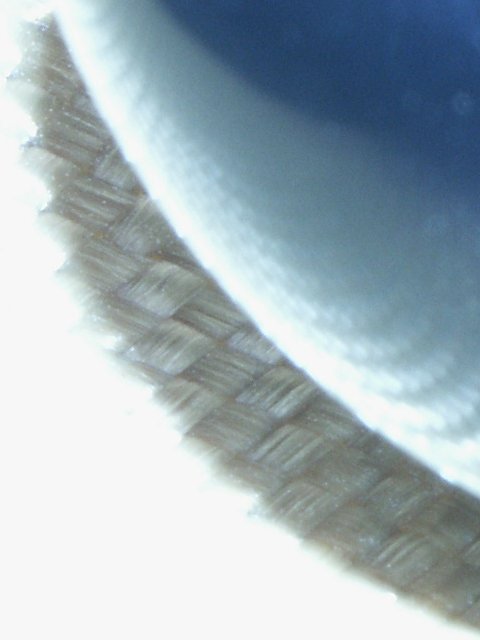
This is a close up of the centre of a speaker cone.
The weave is the yellow cone itself, the shiny blue thing is the black plug at the centre. The burnt out to white colours are because I over-exposed it with the flash.
Statistics
Place: 186 out of 218 Avg (all users): 4.2627 Avg (commenters): 4.9048 Avg (participants): 4.2692 Avg (non-participants): 4.2525 Views since voting: 1003 Votes: 255 Comments: 24 Favorites: 0
Hehe, I though this one might confuse a few people. I hoped for a little better than 13 1's though :-(. Thanks for the 8's, 9's and 10 whoeever you were. I'm glad to see some people appreciated even if they didn't 'get it'. Which, by the way, was the intention - to go for something totally abstract and completely whacked out!
Take a look in the forums for a better explanation of what you're looking at. I've also included a link to some alternative (and less bizarre) versions.
this shot would be really really cool if it were just in focus. it has great color, contrast, and AI like the curving line. also good use of negative space.
I'm so sorry, but I am missing this one all over. I see a large white space on the left and bottom, a swatch of what looks like some kind of weaving in the middle and a vague sense of a pattern of holes on the right. Without the title, I really have to say ??????. With the title, I think I can "see this", but very vaguely. After the challenge week, I would like to see a version of this, maybe a whole lot less abstractly. I have no imagination, nor much taste for abstract, my bad. Still, all of this said (written), I still cannot justify a score higher than 5. Swash
The part of your photo that's in focus is good, very interesting, but the large white area at the bottom/left, and the blue area at top/right are distracting.
ok, i admit it. i'm totally baffled by this one. the title also doesn't help. i must be just really dumb today. anyway. i kind of like the lines running through the photo, but i'm not sure about the colors - i'm a sucker for strong colors i guess. and there are two differnt types of textures here for sure, but they are not the thing that jumps out at me. it's more the lines and the colors. i can't wait to find out on sunday what i'm trying to analyze here! ;) -- gr8photos (5)
At first, I thought, "what the . . ." but then , the more I look at it, the more I like it. I like the blown out (?) area in the lower left, and how it contrasts with the blue in the opposite corner. I'll be interested to see how this one does -- I like it. karmat
I guess this suffers a lot from too much compression, i.e. would look a lot better if you went for more quality in the jpeg settings. The lack of focus would probably be less of an issue then, too. finally, I think there's too much light in this shot, or the lighting is simply not balanced enough. 4 beegee
WAY over compressed. Remeber you have a 150K file size limit your only using 1/5 of that and as a result compressing out most of your detail Do all of your photoediting as a tiff file converted from the jpg so that up until your final version so your not loosing image information with each save. Read the forums on hints and tricks. (And yes Ive learned the same thing the same way.) - rjhawkin





 Add photograph to your favorites
 Add photographer to your favorites


