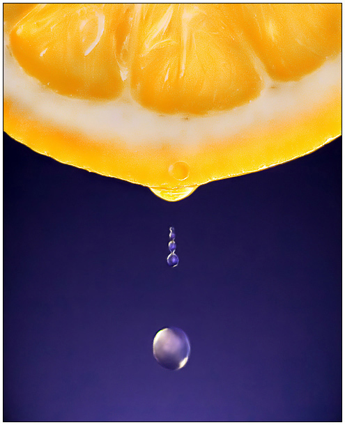
Yeah I know, its a little soft, but for some reason the original was really grainy so I had to do a little noise reduction. I like it so lets see if its "abstract" enough
Statistics
Place: 11 out of 199 Avg (all users): 6.5091 Avg (commenters): 7.9375 Avg (participants): 6.1059 Avg (non-participants): 6.7630 Views since voting: 2888 Views during voting: 404 Votes: 220 Comments: 27 Favorites: 11 (view)
beautiful, I normally don't like complementary colors, but this looks really good, and yeah, I'd agree that it's a little soft, but still nice, maybe just keep the drop sharp? ... and congrats on 12th place
Great lighting, color and composition. The formation of the drops makes this one really stand out from other drop series I've seen. Only nitpick it the overall image clarity, which on the other hand also makes this look very painting like.
Wow! Awesome! I love the contrast between the blue and yellow and the perfectly spherical drops. The detail in the fruit adds some interest to the picture. Top ten definitely. The only thing I don't like about this pic is the neat-imaged look to it. I'd tone down on the neat-imaging.
I really liked the thumbnail of this picture. I liked how the blue is lighter against the big drop. Concept is great but for me when you look at the large size the drops look like they are comming towards me instead of down. This might have been intentional but for me it just took something away from it.
MMMMMM, refreshing. The ONLY thing I don't like about this photo is the biggest drop. It seems drawn in....or something. Still...it made me say, "MMMM" out loud!





 Add photograph to your favorites
 Add photographer to your favorites

 Photographer found comment helpful.


