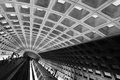
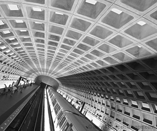
The Ballston stop on the Washington, DC Metro is one away from my house on my daily commute. I chose it because it has the entry platform all the way at one end so I could get the longest lines.
I played around with several angles at this and the station where I work. I was trying to get some of the feel of this shot:
It was pretty dark, and it was handheld (you have to have a permit to shoot with a tripod), but with the processing, perfect sharpness didn't really matter.
I chose this shot over others because it really maximizes the lines coming in from the right. It puts the end of the train at about the lower left 1/3 intersection.
I think the shadow adds an emphasis that isn't there when the train is gone or at the other end of the station.
I think this series is the strongest set of leading lines of any shot I've taken.
I didn't go wide open on the aperture because I wanted at least some depth of field. However, that meant the shutter was a little slower, so I braced against a railing.
I took a little too long at one station and the station manager came over to ask me what I was doing!
I had fun using my new curves skills to really emphasize the ceiling lines and the train while de-emphasizing the people on the platform. More extreme contrast enhancement would make them invisible but also wipe out the tracks and lights along the empty platform, which were such nice additional lines that I didn't want to lose them.
I did end up blowing out the lights down the middle of the tracks, but such is life in basic editing.
Other edits: cropped out some distracting stuff on the left,resized, USM, save for Web.
I owe a debt of gratitude to Yanko for showing me what's possible with curves in a thread where he helped me bring out the potential of a shot of a ferry boat in fog.
Added 8/3/06: As part of the techniques exploration group, I created a high contrast version. Not sure which I like better:
This is available as an 8 x 10 print through the link above or as a 4 x 6 print:
Statistics
Place: 28 out of 447 Avg (all users): 6.1527 Avg (commenters): 7.0909 Avg (participants): 6.0729 Avg (non-participants): 6.2243 Views since voting: 2196 Views during voting: 286 Votes: 203 Comments: 22 Favorites: 3 (view)
In response to your response on my picture: I think that apart from the B&W conversion, your square-ish crop, as you pointed out, adds to the impact of the lines. Secondly, you have the curved lines in the ceiling that add a lot to the picture. Mine is indeed more suitable for a perspective challenge ;-)
Very nice, I should have presented my entry in B&W as well (take a look, it's similar to yours), but didn't have the time to tweak the curves like you did. Good job!
Hey thanks for the compliment. Feel free to email/PM any time. Btw, I really like how you shot this. The focal point is off center and all the lines just shoot out filling the frame.
I quite like this, and it's cleverly composed also. I wonder if your contrast wasn't higher it wouldn't give a bit more impact to the image. Compositionally, placing the end point of the leading lines right on the classic thirds point is perhaps a touch blatant for me - though it's a very good starting point.






 Add photograph to your favorites
 Add photographer to your favorites


 Photographer found comment helpful.


