|
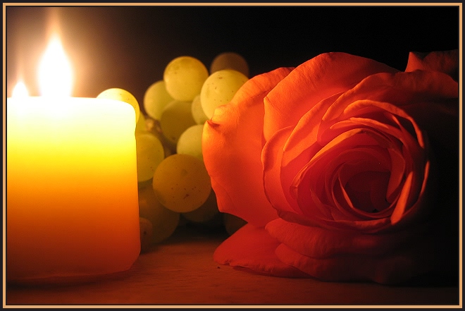
HEY, now I REALLY like this one. It's interesting how some of the lines in the grapes and some of the lines in the rose match up so closely it makes the rose seem almost translucent. Did you plan this (it woulda been hard in the dark) or get lucky??? Nice complimentery hues (not sure if hue is the right term...still trying to relearn all this stuff myself) and textures. The glare around the flame is slightly distracting but not obnoxiously so. If I was scoring it (with no real topic involved) it would be 8 or 9. |




 Add photograph to your favorites
 Add photographer to your favorites

 Photographer found comment helpful.


