Good use of color here. I don't know what is to the left, but a crop to remove the corner on the right would have "made this shot". Still, in my top 20.
this is a great shot of texture, but what really makes this a cool photo is the color. very well done. the only thing I could ask for is a more well defined point of interest. you have the texture and the lighting just perfect, you just need some sort of element to capture attention. great job!
Composition7 Originality7 Technical Aspects6 Meets Challenge7 Total Score7
For those that are just learning, like me.
Composition: Scoring in this area is based on basic composition of a picture and includes the rule of thirds, balance, cropping, and curved and diagonal lines. Subject matter that does not lend itself to the picture or otherwise unwanted is also considered here.
Originality: Scoring in this area is based on pictures or concepts that I have seen, as well as how much effort you have invested in the picture. Usually a little something that sets it aside from a snapshot. Does it make me want to come back for another look? You know things like that.
Technical Aspects: Focus, exposure, lighting, and other special effects (done by the camera), and post processing are all considered in this category.
Meets Challenge: This is based on my interpretation of if you, have/have not, met the challenge. This is fairly simple but quite important for this site.
There are many sites that can give you assistance in achieving better skills in photography, but I think the best way to learn is to take pictures and show them to other people. Believe me when it is a good one you will know it.
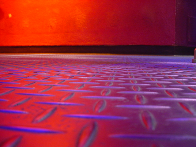
Nice colors, merging blue and red reflects gives this picture an abstract feeling very pleasant. But why don't you have cropped the little thingie on the right ? And the orange spot on the top right ? Doing this, you could have cropped from the top to get back to the 3:4 proportion, this would empasize the floor (I guess it's the floor).
This picture would be better without the enormous amounts of red. After studing the picture awhile, i still cannot tell the actual subject, and the black line in the back is a bit distracting. (4) AquaGoddess12880
Fits the challenge 10, Originality 10, Composition 2, = 7.333 (7) There is some oddness to this at the left and right sides of the picture. Perhaps they could have been cropped out? Otherwise this is eye catching.
Fun idea. However, I think some areas should have been cropped out: the little "step"? at top right and the yellow spot and two dark spots at top left. If you're going for abstract, it should have been starker to make it more dramatic.





 Add photograph to your favorites
 Add photographer to your favorites


