|
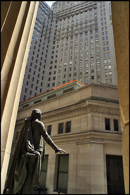
The concept here is really good but the picture looks a little unbalanced. The columns used in the foreground as framing lack symmetry and tend to lead the viewers eyes to the bottom of the image instead of to the top. I like the lighting on the statue, as the highlights and shadows work well in producing depth to the statue. |







 Add photograph to your favorites
 Add photographer to your favorites

