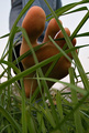
This photo looks a bit blurry to me here, I'm not quite sure, but I think your camera focused o the central tower, which looks fairly sharp, but the other towers and the grass look out of focus. I think what was needed here (based on these conclusions, which could be wrong) is a hihger f/ number to bring a deeper overall depth of field. This also may have meant shoting on a tripod, as it would affect your shutter speed.overall good composition of elements, everything just needs to be in sharp focus here.
What a shot. Most of the time, we try to NOT have the lines in the photo, but this just works great. Too bad, you could have entered this in the Lines Challenge. Good work. 8
Sorry but too much saturation in this shot for my taste, I would have liked it better with slightly muted colors and then instead even more contrast. Other than that, pretty good.







 Add photograph to your favorites
 Add photographer to your favorites

 Photographer found comment helpful.


