Author Thread
Post actions
you have a great eye..nice tones.
Comments Made During the Challenge
Post actions
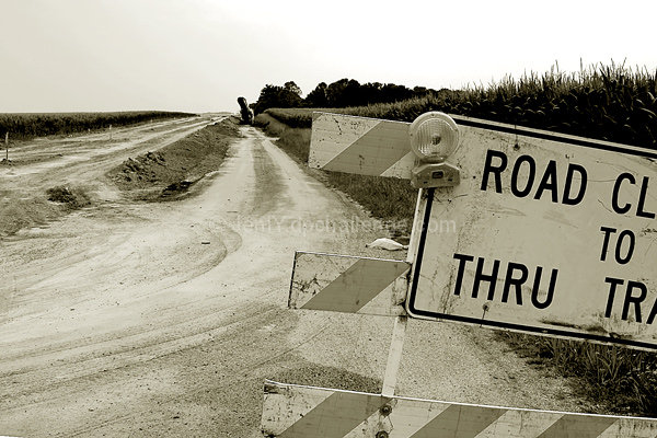
I am not really fond of the clipping of the road sign, I think I would have liked this image better if all of it had been in the frame and you had used the road more diagonally to draw the eye in towatds it. In short, I think you could have composed this better.
Post actions
I like this image becasue although it shows progress and expansion for the city, the tilt of the sign and the fact that it feels like it is falling off screen gives the feeling that the city is losing something also
Post actions
Good use of monochrome. Nice framing.
Post actions
I can't think of anything to say.
Post actions
Works well in monochrome and meets challenge, though if road work there is anything like it is here, the progress is very, very slow.
Post actions
Post actions
I like this shot, but I can't figure out what that thing is that my eye is drawn to at the end of the road.
Post actions
Post actions
I like the black and white, would have been better if the whole sign was in the shot
Post actions
Good picture.
Post actions
Post actions
I'd have included more of the sign so it can be read fully.






 Add photograph to your favorites
 Add photographer to your favorites


 Photographer found comment helpful.


